Shine on you crazy diagram – part 4
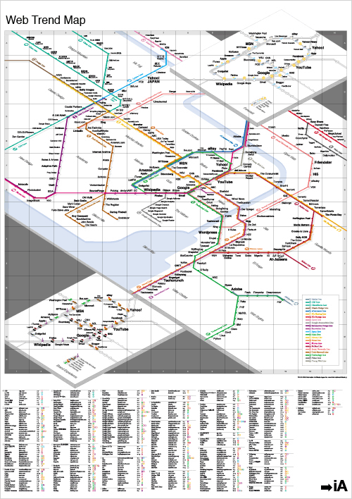
The map by Information Architects Japan pins down nearly 300 of the most successful and influential websites to the greater Tokyo area train map.
Different train lines correspond to different web trends such as innovation, news, social networks, and so on:
The bottom layer includes a rating of brand experience analogous to restaurant experience. It illustrates our perception of user experience and brand management of the main stations. We studied the usability, user value, and interface (simplicity, character, and feedback), and rated each site on a scale of eating at various types of Japanese restaurants.
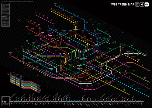
And as the internet is a shifting medium, and sites come and go, there’s a need for a yearly update. See the underground map for 2009:
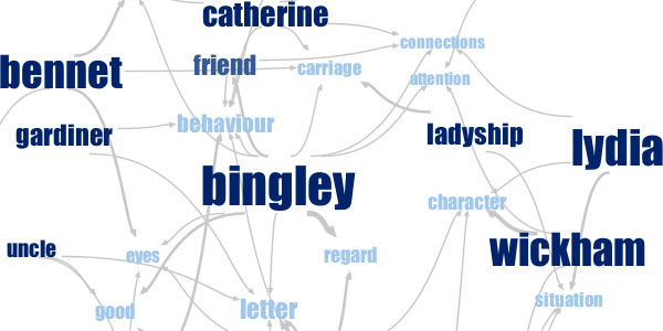
Ah, visualizations, they work in so many ways and for so many uses. Take e.g. then IBM lab based “Many Eyes” technique I found via infostethics:
Phrase Net is based on simple pattern matching of words or phrases (advanced users can use also “regular expressions”) within text, to detect the relationships between concepts hidden in books, speeches, and other unstructured documents. For instance, one can search for the term “and”, and the resulting graph will show the “linking phrases” of the form “word1 and word2″. Each of these phrases defines a connection between two words. The resulting graph shows clusters of related concepts and people.
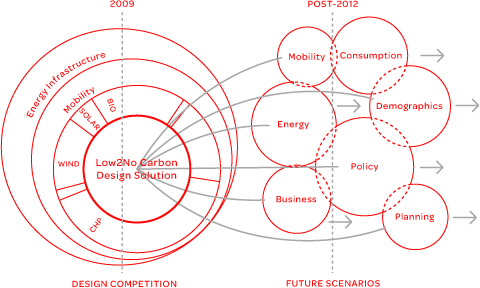
Definitely interesting for Jane Austen fanboys and -girls … and for more everyone else this cute little image (hey, I don’t exactly know what it means and why so many circles were needed, but anyway) – enjoy:


